Anscombe’s quartet
Grouped violinplots with split violins
 |
| Add caption |
Joint kernel density estimate
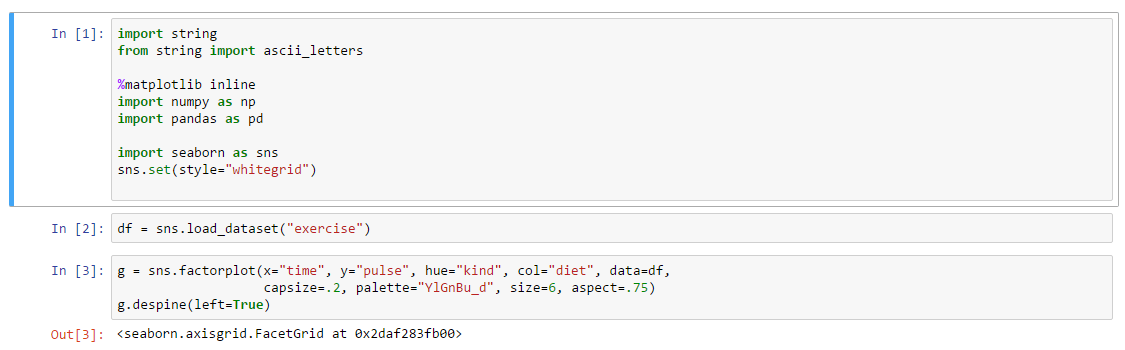
Plotting a three-way ANOVA
Timeseries from DataFrame
Scatterplot with categorical variables
Discovering structure in heatmap data
Barplot timeseries
FacetGrid with custom projection


No comments:
Post a Comment