One of the most appealing things about R is its ability to create data visualizations with just a couple of lines of code.
For example, it takes just one line of code -- and a short one at that -- to plot two variables in a scatterplot. Let's use as an example the mtcars data set installed with R by default.
For example, it takes just one line of code -- and a short one at that -- to plot two variables in a scatterplot. Let's use as an example the mtcars data set installed with R by default.
The ggplot2 package was created by Hadley Wicham. ggplot2 allows you to create graphs that represent both univariate and multivariate numerical and categorical data in a straightforward manner. Grouping can be represented by color, symbol, size, and transparency.
install.package("ggplot2")
library("ggplot2")
### show info about the data
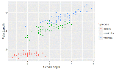
qplot(Sepal.Length, Petal.Length, data = iris, color = Species)
qplot(Sepal.Length, Petal.Length, data = iris)
qplot(Sepal.Length, Petal.Length, data = iris, color = Species)
qplot(Sepal.Length, Petal.Length, data = iris, color = Species, size = Petal.Width)
qplot(Sepal.Length, Petal.Length, data = iris, geom = "line", color = Species)
qplot(age, circumference, data = Orange, geom = c("point", "line"), colour = Tree)
### show info about the data
head(iris)
qplot(Sepal.Length, Petal.Length, data = iris, color = Species)
qplot(Sepal.Length, Petal.Length, data = iris)
qplot(Sepal.Length, Petal.Length, data = iris, color = Species)
qplot(Sepal.Length, Petal.Length, data = iris, color = Species, size = Petal.Width)
qplot(Sepal.Length, Petal.Length, data = iris, geom = "line", color = Species)
qplot(age, circumference, data = Orange, geom = c("point", "line"), colour = Tree)
### show info about the data
head(diamonds)
### comparison qplot vs ggplot
##qplot histogram
qplot(clarity, data=diamonds, fill=cut, geom="bar")
# ggplot histogram -> same output
ggplot(diamonds, aes(clarity, fill=cut)) + geom_bar()
ggplot also produces the same output.
### how to use qplot
# scatterplot
qplot(wt, mpg, data=mtcars)
# continuous scale vs. discrete scale
head(mtcars)
qplot(wt, mpg, data=mtcars,colour=cyl)
levels(mtcars$cyl)
qplot(wt, mpg, data=mtcars,colour=factor(cyl))
# use different aesthetic mappings
qplot(wt, mpg, data=mtcars,shape=factor(cyl))
qplot(wt, mpg, data=mtcars,size=qsec)
#combine mappings (hint: hollow points, geom-concept, legend combination)
qplot(wt, mpg, data=mtcars, size=qsec, color=factor(carb), shape=I(1))
# bar-plot
qplot(factor(cyl), data=mtcars, geom="bar")
# use different display of bars (stacked, dodged, identity)
head(diamonds)
qplot(clarity, data=diamonds, geom="bar", fill=cut, position="stack")
qplot(wt, mpg, data=mtcars, color=factor(cyl), geom=c("point", "smooth"))
# illustrate flip versus changing of variable allocation
qplot(mpg, wt, data=mtcars, facets=cyl~., geom=c("point", "smooth"))
qplot(mpg, wt, data=mtcars, facets=cyl~., geom=c("point", "smooth")) + coord_flip()
qplot(wt, mpg, data=mtcars, facets=cyl~., geom=c("point", "smooth"))
# using ggplot-syntax with qplot (hint: qplot creates layers automatically)
qplot(mpg, wt, data=mtcars, color=factor(cyl), geom=c("point","line"))
# add an additional layer with different mapping
p.tmp + geom_point() + geom_point(aes(y=disp))
# setting aesthetics instead of mapping
p.tmp + geom_point(color="darkblue")
# dealing with overplotting (hollow points, pixel points, alpha[0-1] )
t.df <- data.frame(x=rnorm(2000), y=rnorm(2000))
p.norm <- ggplot(t.df, aes(x,y))
p.norm + geom_point()
p.norm + geom_point(shape=1)
p.tmp + geom_point(color="darkblue")
# dealing with overplotting (hollow points, pixel points, alpha[0-1] )
t.df <- data.frame(x=rnorm(2000), y=rnorm(2000))
p.norm <- ggplot(t.df, aes(x,y))
p.norm + geom_point()
p.norm + geom_point(shape=1)
p.norm + geom_point(shape=".")
p.norm + geom_point(colour=alpha("black", 1/2))
p.norm + geom_point(colour=alpha("blue", 1/10))
# using scales (color palettes, manual colors, matching of colors to values)
p.tmp <- qplot(cut, data=diamonds, geom="bar", fill=cut)
p.tmp
p.tmp + scale_fill_manual(values=c("#7fc6bc","#083642","#b1df01","#cdef9c","#466b5d"))
### create a pie-chart, radar-chart (hint: not recommended)
# map a barchart to a polar coordinate system
p.tmp <- ggplot(mtcars, aes(x=factor(1), fill=factor(cyl))) + geom_bar(width=1)
p.tmp
p.tmp + coord_polar(theta="y")
p.tmp + coord_polar()
### create survival/cumulative incidence plot
library(survival)
head(lung)
# create a kaplan-meier plot with survival package
t.Surv <- Surv(lung$time, lung$status)
t.survfit <- survfit(t.Surv~1, data=lung)
plot(t.survfit, mark.time=TRUE)


No comments:
Post a Comment