Sunday, 12 February 2017


Friday, 3 February 2017
Plotting State,District,Taluk level maps Using R
Working with R, we will need two R packages :
# Load required libraries
library(sp)
library(RColorBrewer)
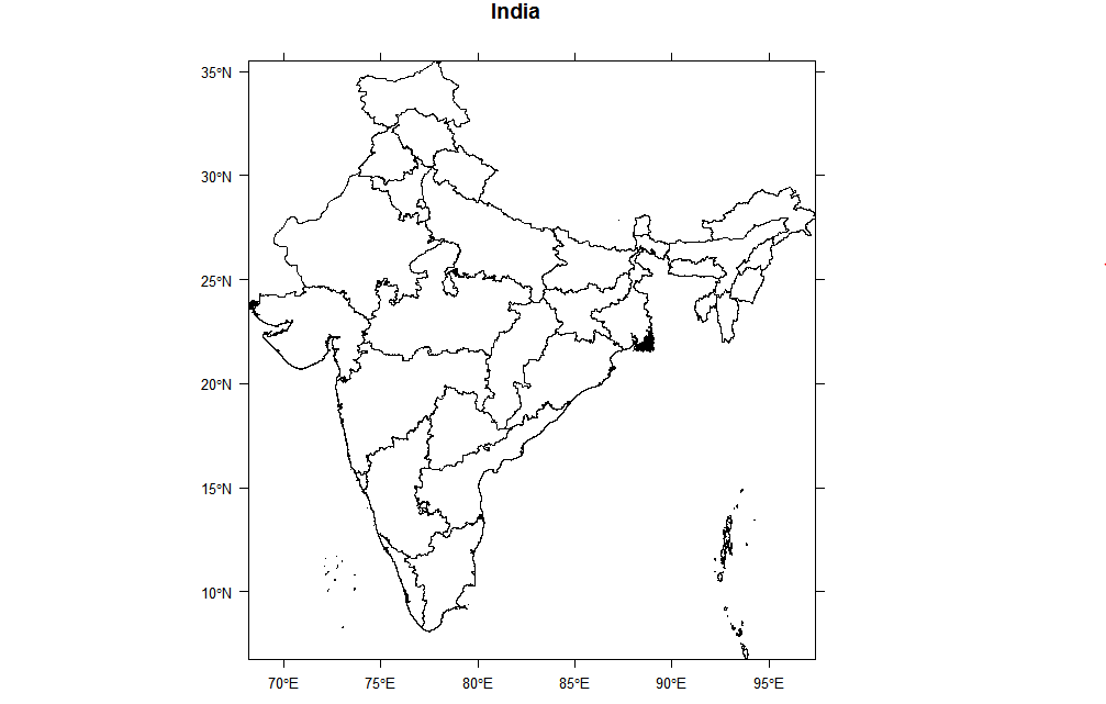
# load level 1 india data downloaded from http://gadm.org/country
load("IND_adm1.RData")
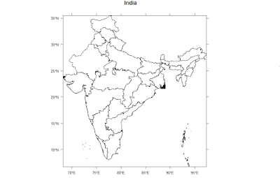
ind1=readRDS("IND_adm1.rds")
spplot(ind1, "NAME_1", scales=list(draw=T), colorkey=F, main="India")


# load level 2 india data downloaded from http://gadm.org/country
load("IND_adm2.RData")
ind2=readRDS("IND_adm2.rds")


# load level 3 india data downloaded from http://gadm.org/country
load("IND_adm3.RData")
ind3=readRDS("IND_adm3.rds")
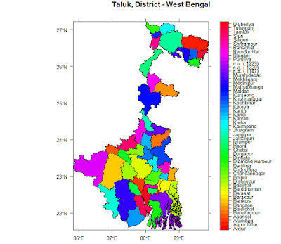
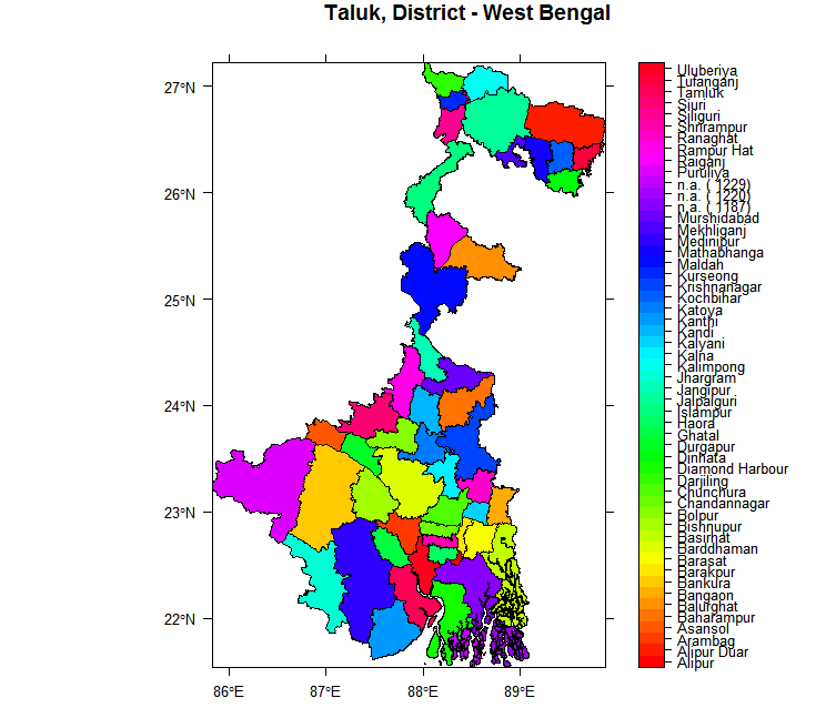
# extracting data for West Bengal
wb3 = (ind3[ind3$NAME_1=="West Bengal",])
and then plot the subdivision or taluk level map as follows :
#plotting districts and sub-divisions / taluk
wb3$NAME_3 = as.factor(wb3$NAME_3)
col = rainbow(length(levels(wb3$NAME_3)))
spplot(wb3,"NAME_3", main = "Taluk, District - West Bengal", colorkey=T,col.regions=col,scales=list(draw=T))


# Load required libraries
library(sp)
library(RColorBrewer)
# load level 1 india data downloaded from http://gadm.org/country
load("IND_adm1.RData")
ind1=readRDS("IND_adm1.rds")
spplot(ind1, "NAME_1", scales=list(draw=T), colorkey=F, main="India")
# map of India with states coloured with an arbitrary fake data
ind1$NAME_1 = as.factor(ind1$NAME_1)
ind1$fake.data = runif(length(ind1$NAME_1))
spplot(ind1,"NAME_1", col.regions=rgb(0,ind1$fake.data,0), colorkey=T, main="Indian States")

and then executing these commands :
# map of West Bengal ( or any other state )
wb1 = (ind1[ind1$NAME_1=="West Bengal",])
spplot(wb1,"NAME_1", col.regions=rgb(0,0,1), main = "West Bengal, India",scales=list(draw=T), colorkey =F)

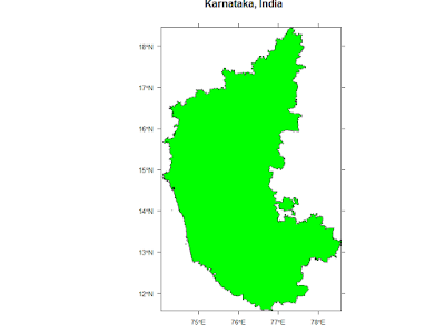
# map of Karnataka ( or any other state )
kt1 = (ind1[ind1$NAME_1=="Karnataka",])
spplot(kt1,"NAME_1", col.regions=rgb(0,1,0), main = "Karnataka, India",scales=list(draw=T), colorkey =F)

# load level 2 india data downloaded from http://gadm.org/country
load("IND_adm2.RData")
ind2=readRDS("IND_adm2.rds")
and then plot the various districts as
# plotting districts of a State, in this case West Bengal
wb2 = (ind2[ind2$NAME_1=="West Bengal",])
spplot(wb2,"NAME_1", main = "West Bengal Districts", colorkey =F)

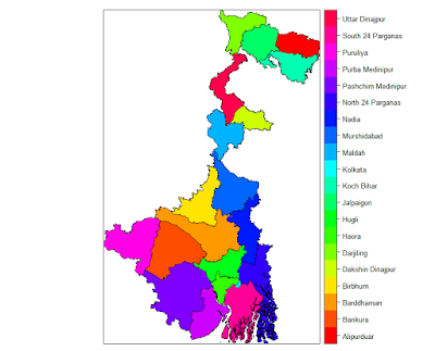
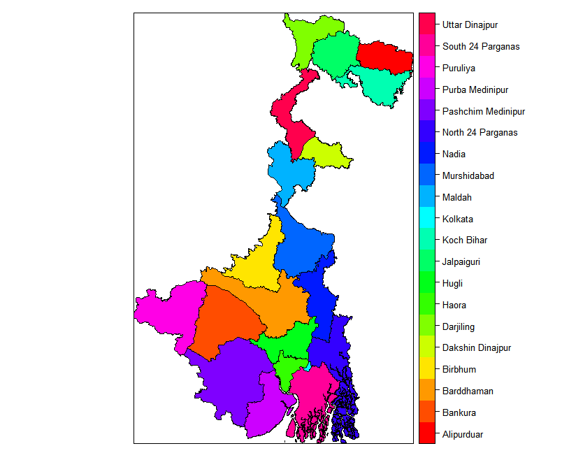
To identify each district with a beautiful colour we can use the following commands :
# colouring the districts with rainbow of colours
wb2$NAME_2 = as.factor(wb2$NAME_2)
col = rainbow(length(levels(wb2$NAME_2)))
spplot(wb2,"NAME_2", col.regions=col, colorkey=T)
# colouring the districts with some simulated, fake data
wb2$NAME_2 = as.factor(wb2$NAME_2)
wb2$fake.data = runif(length(wb2$NAME_1))
spplot(wb2,"NAME_2", col.regions=rgb(0,wb2$fake.data, 0), colorkey=T)

# colouring the districts with range of colours
col_no = as.factor(as.numeric(cut(wb2$fake.data, c(0,0.2,0.4,0.6,0.8,1))))
levels(col_no) = c("<20%", "20-40%", "40-60%","60-80%", ">80%")
wb2$col_no = col_no
myPalette = brewer.pal(5,"Greens")
spplot(wb2, "col_no", col=grey(.9), col.regions=myPalette, main="District Wise Data")

# load level 3 india data downloaded from http://gadm.org/country
load("IND_adm3.RData")
ind3=readRDS("IND_adm3.rds")
# extracting data for West Bengal
wb3 = (ind3[ind3$NAME_1=="West Bengal",])
and then plot the subdivision or taluk level map as follows :
#plotting districts and sub-divisions / taluk
wb3$NAME_3 = as.factor(wb3$NAME_3)
col = rainbow(length(levels(wb3$NAME_3)))
spplot(wb3,"NAME_3", main = "Taluk, District - West Bengal", colorkey=T,col.regions=col,scales=list(draw=T))
# get map for "North 24 Parganas District"
wb3 = (ind3[ind3$NAME_1=="West Bengal",])
n24pgns3 = (wb3[wb3$NAME_2=="North 24 Parganas",])
spplot(n24pgns3,"NAME_3", colorkey =F, scales=list(draw=T), main = "24 Pgns (N) West Bengal")

# now draw the map of Basirhat subdivision
# recreate North 24 Parganas data
n24pgns3 = (wb3[wb3$NAME_2=="North 24 Parganas",])
basirhat3 = (n24pgns3[n24pgns3$NAME_3=="Basirhat",])
spplot(basirhat3,"NAME_3", colorkey =F, scales=list(draw=T), main = "Basirhat,24 Pgns (N) West Bengal")

# zoomed in data
wb2 = (ind2[ind2$NAME_1=="West Bengal",])
wb2$NAME_2 = as.factor(wb2$NAME_2)
col = rainbow(length(levels(wb2$NAME_2)))
spplot(wb2,"NAME_2", col.regions=col,scales=list(draw=T),ylim=c(23.5,25),xlim=c(87,89), colorkey=T)


